Short notes › Grade 11 · සිංහලෙන්

Grade 11 Data Representation and Prediction: Short Notes

11 ශ්‍රේණිය · 2 වාරය · 15 පරිච්ඡේදය · දත්ත නිරූපණය හා අර්ථකථනය

67%

of Grade 11 term tests include it (41 of 61)

418

marks in past papers (65 questions)

12 min

full lesson with quick checks

🎯 What you'll learn

  • Draw and read histograms with unequal class widths
  • Draw a frequency polygon, with or without a histogram
  • Build a cumulative frequency table and curve
  • Read the median, quartiles and inter-quartile range from the curve
  • Find quartiles of a short list and pie chart angles

Who gets the extra class?

A maths teacher in Galle times 40 students on a test. She wants to give extra help to the slowest quarter. Where is the cut-off? Sorting 40 times by hand is slow. One curve, the cumulative frequency curve, gives the answer in seconds.

Histograms: area is frequency

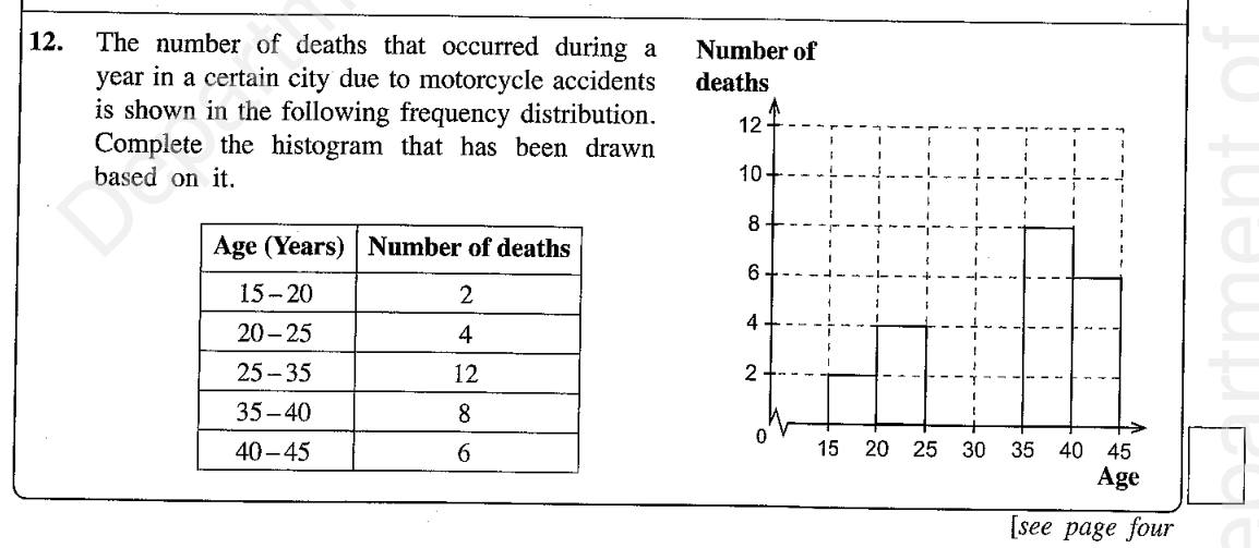
In a histogram the area of each bar shows the frequency. With equal class widths, height works too.When widths differ:1. Take the smallest class width as 1 unit.2. Height = frequency ÷ (number of units in the width).A class twice as wide with frequency 24 gets height 24 ÷ 2 = 12.

✏️ Bars with unequal widths

Times (minutes) 50 Kandy students take to reach school: 10–20: 5, 20–30: 13, 30–50: 24, 50–60: 8. Find the height of each bar.
010203050607051024
  1. 1Smallest width = 10 minutes = 1 unit
  2. 210–20, 20–30, 50–60 are 1 unit wide: heights 5, 13, 8
  3. 330–50 is 2 units wide: height = 24 ÷ 2 = 12

✅ 5, 13, 12, 8

⚠️ Don't draw the wide bar too tall

O/L reports keep finding bars drawn with height = frequency even when the class is wider, and students reading a wide bar's height as its frequency. In the example, a bar of height 24 on 30–50 would show 48 students! Always divide by the number of units when drawing, and multiply when reading.

Frequency polygon

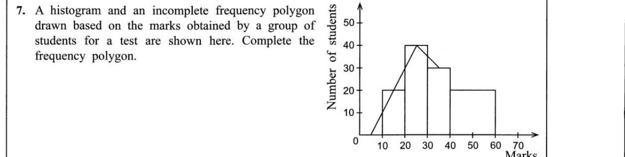
Join the midpoints of the tops of the bars with straight lines (the amber line in the school-times histogram).Then add one point on the axis half a unit before the first bar and half a unit after the last (here 5 and 65). The polygon then encloses the same area as the histogram.Without a histogram, plot (class midpoint, height) and do the same.

Cumulative frequency

Cumulative frequency = running total of the frequencies.Test times of 40 students:10–20: 3 → 320–30: 7 → 1030–40: 12 → 2240–50: 10 → 3250–60: 6 → 3860–70: 2 → 40'32' means 32 students took less than 50 minutes. The last total must equal n.

The cumulative frequency curve

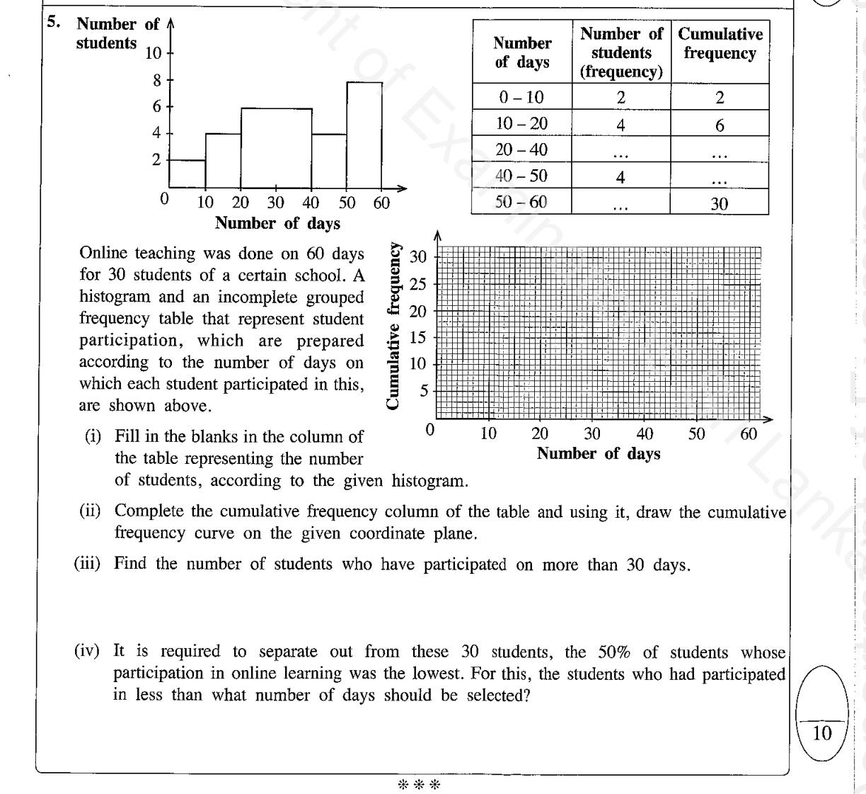
Plot each total at the upper class boundary: (20, 3), (30, 10) … (70, 40). Start at (10, 0). Join with a smooth curve. Dashed lines read the quartiles.
1020304050607010203040Q₁Q₂Q₃

⚠️ Upper boundaries, not midpoints

In 2018 and 2020 many candidates plotted cumulative frequencies at class midpoints, and others forgot the starting point at frequency 0. Cumulative frequency counts everything up to the end of a class, so plot at the upper boundary. If classes are written 10–19, 20–29…, the boundaries are 19.5, 29.5…

🧮 Reading the quartiles

Find the position on the cumulative frequency axis, go across to the curve, then down to read the value. For n = 40: Q₁ ≈ 30, median ≈ 38, Q₃ ≈ 48, so the inter-quartile range ≈ 18 minutes.

Q₁ at n/4, Q₂ (median) at n/2, Q₃ at 3n/4; IQR = Q₃ − Q₁

Quartiles of a short list

For a list of n values (not grouped), first put them in order. Then:• Q₁ is the (n + 1)/4 th value• the median is the (n + 1)/2 th value• Q₃ is the 3(n + 1)/4 th valueThese are positions, not the answers. Count along the ordered list to find the values.

✏️ A batsman's scores

A school cricketer from Matara scored 12, 45, 3, 27, 60, 33, 8, 19, 51, 27, 40 runs in 11 matches. Find Q₁, Q₃ and the inter-quartile range.
  1. 1Order: 3, 8, 12, 19, 27, 27, 33, 40, 45, 51, 60
  2. 2Q₁ position = (11 + 1)/4 = 3rd value = 12
  3. 3Q₃ position = 3 × 12/4 = 9th value = 45
  4. 4IQR = 45 − 12 = 33 runs

✅ Q₁ = 12, Q₃ = 45, IQR = 33

⚠️ Position is not value

O/L examiners note students who confuse the quartile position with the quartile itself, or who find 25% of the largest value. For the batsman, (n + 1)/4 = 3 does not mean Q₁ = 3: it means 'the 3rd value', which is 12. Also, don't forget to order the data first.

📌 Remember

• Histogram: area = frequency. Unequal widths: height = frequency ÷ units.• Frequency polygon: join mid-tops, close half a unit beyond each end.• Cumulative frequency: plot at upper boundaries, start at 0, smooth curve.• Grouped: Q₁ at n/4, median n/2, Q₃ 3n/4. List: (n + 1)/4 etc.• IQR = Q₃ − Q₁. Pie angle = f/n × 360°.

🧾 Quick revision sheet

In a histogram, what shows the frequency?The area of the bar.
Bar height for a class 3 units wide, frequency 21?21 ÷ 3 = 7
Where do you plot cumulative frequency?At the upper class boundary, starting from 0 at the first lower boundary.
Grouped data: positions of Q₁, Q₂, Q₃?n/4, n/2, 3n/4
Ungrouped list: position of Q₁?The (n + 1)/4 th value of the ordered list.
Inter-quartile range?Q₃ − Q₁
Pie chart sector angle?frequency ÷ total × 360°
Last point of a frequency polygon?On the axis, half a class unit beyond the last bar.

Now test yourself: 5 quick checks

The full lesson checks your answers as you go, and Gedara Sir tracks which parts you've got.

Past paper questions on Data Representation and Prediction

Paper I Part B Q4 · 10 marks

Data Representation and Prediction · Frequency Distributions · Probability

G.C.E. O/L 2024

Read a frequency polygon into a table; histogram; cumulative frequency; probability
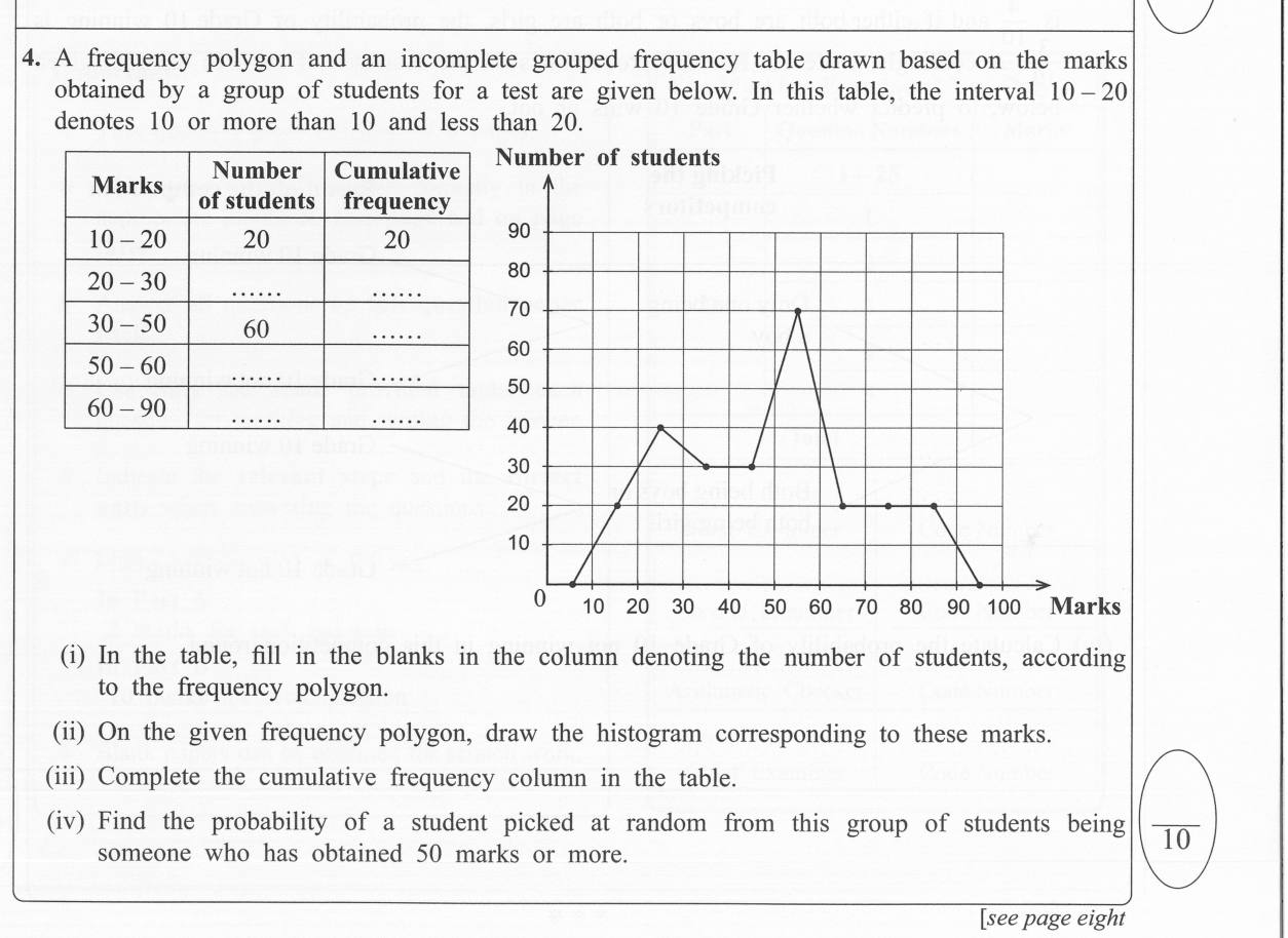
Paper I Part B Q4: Read a frequency polygon into a table; histogram; cumulative frequency; probability🔒 Answer & steps: try it free in Gedara Sir→

More Grade 11 notes